Web Design Trends
Introduction
Web design as a digital medium is more subject to advancements in technology. But we have already crossed 18 years in this new millennium, and no surprise in it.
The most surprising thing is the way how designers competed with and continued to adopt the increasing technical challenges and create innovative websites that are clear, user-friendly, and consistent with the corporate style.
Last year, i.e., 2017 have seen several technological advancements including mobile usage rather desktop browsing. In this regard, 2018 is with complete mobile capabilities in distinct ways like we have never experienced earlier. Even desktop must continue with new evolutions in trends to stay relevant.
Considering all these, let’s have a glance at some notable web design trends designed to take over this year.
Significant Web Designing Trends to Watch in 2018
- Color schemes
- Particle backgrounds
- Mobile first
- Drop shadows & depth
- Integrated animations
- Dynamic gradients
- Big, bold typography
- Custom illustrations
- Grid layouts
Saturated Color Schemes
2018 is the year for super excess online colors. Many designers and brands cemented with web-safe colors in the past whereas now they are becoming more courageous approach including vibrant and supersaturating shades combined with headers, which are not just horizontal but recreated with hard angles and slashes.
The technological advancements to reimagining colors in devices with screens and monitors help to reproduce vibrant colors.
Vibrant and clashing colors are useful for brands, which instantly attract the attention of the visitors, but also perfect for brands to put themselves traditional and web-safe.
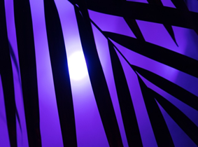
Image 1: pxhere
Particle Backgrounds
Applying particle backgrounds are the best way to solve the issues related to performance websites run into a video background.
These are light-weighted animations with JavaScript and allow movement that is created as a natural part of the background with less loading time.
An image says more than a thousand words and can immediately attract the attention of the visitors. Similarly, particle backgrounds can create a memorable impression of a brand in just a few seconds.
In addition to these, motion graphics are becoming more popular on digital platforms providing eye-popping leads back to landing pages.
Mobile First
Mobile browsing has now officially exceeded desktop and these days everyone shops and orders on their Smartphones. Earlier days, it is a clunky process that users were not as quick to adapt and get a decent menu’s on the small screen is a puzzle to the designers.
But now the design of mobile has improved and established the roller burger, minimizing the small screen menu.
The designers have to ditch large to design beautiful phones which client sends in the small screen as icons are more economical regarding of space. It becomes easier to identify and fix UX issues with micro-interactions getting immediate feedback on visitors’ actions.
Drop Shadows & Depth
Using shadows in designing is not a new thing, it have been a staple for quite a while. With the progress of web browsers, there are some exciting variations now, the web designers with parallax and grids layouts are playing with shadows more than ever to create depth and the illusion of a world beyond the screen. This is the direct reaction to the flat design trend popular in the past.
Integrated Animations
With the advancement in the browser technology, more websites are moving from static images to new ways such as animations to engage users with best communication approach.
Unlike particle animations, the smaller animations are helpful to engage the visitor throughout their entire experience on the page.
The animation is the perfect tool to include users in the website story, allowing them to see themselves in their respective characters. They even work well to create fun abstract and meaningful interactions with visitors.
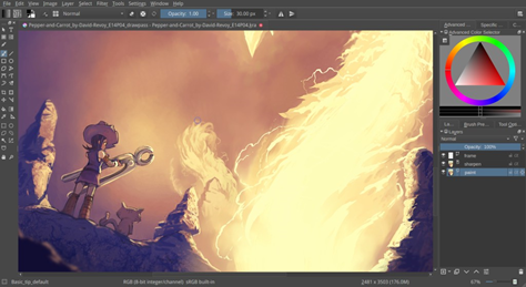
Image 2: open-source-feed
Dynamic Gradients
The flat design has been the most used web design trend over last few years over dimensional colors, but 2018 is the comeback year for the gradient. Unlike olden days, the angles are becoming big with full intensity.
Gradient filter over photos is the latest incarnation and is a great way to make an image look intriguing from a less interesting one. If there is a lack of models to work, a simple gradient background can be a perfect on-trend solution.
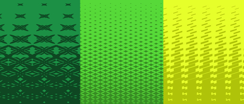
Image 3: Pinterest
Big, Bold Typography
Typography is one of the dominant visual tools, able to set the tone on a website, create personality and evoke emotion all while conveying essential information.
Several browsers support hand-made typefaces, which are enabled by CSS for web browsers. Of course, Internet Explorer has an exception as it is the only one that doesn’t recommend this.
The current trend of contrasting sans serif, large letters and serif heading help create dynamic parallels and to improve UX, especially keep the visitors reading the website.
Particularly in WebPages, headers are the essential SEO elements that help to provide information to the scanning eyes of the readers.
The web designers this year will take complete advantage of extensive and innovative headers spun out of creative typefaces.
Custom Illustrations
Illustrations are versatile and great media for creating images that are friendly, playful and add a fun element to a site. The artists who have experience in making illustrations of personality and tailors to brand’s tone.
It is the perfect trend for fun and dynamic businesses. It can make brands, typically perceived as severe and right-handed and approachable to their customers. Whatever your brand identity is, there exists an illustration to match it.
Grid Layouts
Introduction of unconventional and asymmetrical broken layouts is one among the significant changes occurred in 2017 and is continuing. The appeal of the asymmetrical design is that it is distinctive, unique and experimental sometimes.
Though large-scale brands with substantial content are still using traditional grid-based structures, some brands use unique layouts across the web, as brands create the unique experience to set themselves apart. Most of the regular companies are not interested in beautiful ones, but several bigger ones afford to be a little risky will expect the ideas out-of-the-box from their web designers.
Conclusion
Between the bold gradients, integrated animations and bright colors, 2018 is gearing up to be one of the most fun years in memories around the web. The expectations are very high on what web designers are going to come up in the coming years.
Author Bio: Prasanthi Korada, a Post Graduate in Computer Science from Andhra University was born and raised in Kakinada. She is currently working as a Content Contributor at Mindmajix. Her professional experience includes Content Writing at Vinutnaa IT Services and Digital Marketing at Prominere Software Solutions.