색상 표를 선택하는 방법,,en,당신의 웹 사이트를위한 색깔의 선택은 우연히 만나는 것은 아주 단단하다,,en,방문자의 긍정적 인 반응을 얻으려면 색상이 중요하며 영업 및 전환과 관련하여 중요합니다.,,en,우리는 색을 올바르게 선택하는 것이 매우 힘든 일이라고 말할 것입니다.,,en,우리는 색상이 인간의 마음에 많은 영향을 미친다는 것을 알고 있습니다. 귀하의 웹 사이트에 대해 선택할 색상은 방문자의 참여를 유도하는 효과가 있어야합니다.,,en,당신은 방문자의 마음을 끌 수있는 색상을 선택해야합니다,,en,계속 탐색하게합니다.,,en,그러나 색상 조합을 잘못 선택하면 방문자가 몇 초 내에 웹 사이트를 떠날 가능성이 있습니다.,,en,우리는 당신을 안내 할 것입니다.,,en?
소개
The selection of colors for your website is very hard thing to come across. Therefore, selecting the right combination of colors is exquisite for your website, because it will increase the visual appeal of your website. So, colors are vital to getting the positive response from visitors and it is important regarding sales and conversions. So, we would say a right selection of colors is the very tough job to do. We know that colors influence a lot on human mind the colors which you are going to choose for your website should have effects in order to engage the visitors.
You have to choose those colors which can attract the mind of the visitors, and makes them continue browsing. But if you choose the wrong combination of the colors then it might be possible that visitors leave your website within seconds. We will guide you, 어떤 유형의 조합과 어떤 종류의 색상을 어떤 웹 사이트에 선택해야하는지,,en,웹 사이트에 완벽한 색 구성표를 만드는 방법,,en,웹 사이트를 강력하게 나타내는 최소 두 가지 색상과 사용자로부터 얻고 자하는 피드백을 선택하도록 제안합니다.,,en,적절한 색상 조합을 선택한 후,,en,다른 방법으로 사용하려면 여러 도구가 있어야합니다.,,en,많은 색상 팔레트를 생성 할 수 있습니다.,,en,색상 선택은 중요한 요소입니다.,,en,색깔은 인간의 마음에 영향을 미친다는 것이 과학적으로 입증 되었기 때문에,,en,인간의 두뇌에 심각한 영향을 미치는 몇 가지 색깔을 언급 할 것입니다.,,en,다음은 일부 색상입니다.,,en,빨간,,en,침략,,en,열정,,en,흥분,,en,푸른,,en,평화,,en,차가움과 슬픔뿐만 아니라 우울증,,en,엘로,,en,행복,,en,즐거움,,en.
How to create a perfect color scheme for your website:
We will suggest you to select minimum two colors that powerfully represent your website and also the feedback you want to obtain from users. After choosing the right combination of the colors, then you have a number of tools in order to use them in a different way, and you will be able to generate many of colors palettes.
Colors selection is an important element. Because it is scientifically proved that colors have an influence on the human mind. So, am going to mention some colors which have some serious effects on the human brain. Following are some colors.
- Red: Aggression, passion, and excitement.
- Blue: peace, coolness and sadness depression as well.
- Yellow: Happiness, joy, and light
- Green: health, wealth and nature.
Make contrast between a page’s background and its text:
We will recommend you a combination of reading; a black version should be on the white background. But this is not the ultimate combination for all there is another combination available as well. Dark blue is considers the best background. Always keep in mind that while promoting the product, you should always use less saturated colors.
Choose three different colors and use them regularly on your site:
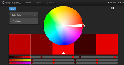
Image 1: Color shades
Colors balance is the most influential and technical art to get users attention towards your site. One thing is very critical; you should always use a fair number of colors; four or five colors are enough; if you use more than that, then visual effects for the users can be irritated. So, it is possible that user skips your website relevant parts.
Adobe Color CC:
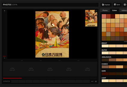
Image 2: Adobe color CC
It is also known as Kuler; it is the very handy tool to create color palettes. After selecting the particular colors just spin the wheel. You can set the each single color in a palette and after that, the remaining colors will set it-self to match the color rule. You can also create color palettes by uploading photos.
Photocopy by ColorLovers:
COLOURlovers is very useful and well-known destination for color innovation and ideas. It has many different tools to create a color configuration. So, “Photocopy” is one of them, which lets you make a color setting through photos. It also has an essential tool which makes color combination after choosing a color.
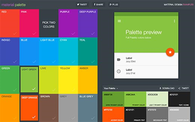
Image 3: Material palette
It permits you to make color schemes while using a design rule it is inspired by Google’s Material design concept. It’s designed color also use in mobile apps, and it can be used in websites as well.
Colors.co:
It is a perfect color scheme generator. You can create color schemes from it by just pressing the space bar. You can also mold a color in the scheme automatically and then fix it. The best thing about is you can also download the color schemes to use in your projects.
This is the complete description about how to choose the colors for your website, which attracts users towards your site. After applying these methods and selection of colors, the visitors will take an interest in your site, and you will get better feedback. So, 이 기사가 귀하 사이트의 색상을 선택하는 데 많은 도움이되기를 바랍니다.,,en,색상 심리학을 사용하여 웹 사이트 전환을 향상시키는 방법,,en,이전에 언급했듯이,,en,그 색깔은 인간 두뇌에 중요한 영향을 미친다.,,en,눈이 색깔을 가질 때,,en,시상 하부와 같은 뇌의 부분과 통신합니다.,,en,시상 하부는 많은 신호를 보냅니다.,,en,뇌하수체쪽으로,,en,내분비 계에서,,en,갑상선쪽으로 그리고 호르몬 분비,,en,궁극적으로 기분,,en,감정과 행동은 그것에서 나온다.,,en,색 심리학이란 무엇인가?,,en,그것은 과학이다.,,en,어떻게 색깔이 인간의 행동에 영향을 주는지,,en,색 심리학은 행동 심리학의 한 분야이다.,,en,고객은,,en,제품에 대한 결정을 내리는 초,,en,상호 작용은 제품의 색상에만 의존합니다,,en.
How to use psychology of colors to enhance website conversions:
As we mentioned earlier, that colors has a significant influence on the human brain. When the eyes take in a color, they communicate with the parts of the brain like hypothalamus. The hypothalamus sends a bunch of signals, towards the pituitary gland, in the endocrine system, then towards thyroid glands and release of hormones. Ultimately in a mood, emotions and behavior come out of it.
What is Color Psychology?
It is science, in which how color influences the human behavior. Color psychology is the branch of behavioral psychology. The customer only takes 90 seconds to make decision about a product and 62-90% interaction is only depends on upon the color of the product.
오른쪽 색상은 올바른 방법으로 사용해야합니다.,,en,우리는 색상 사용이 올바른 방법으로 올바른 색상을 사용해야한다는 완전한 예술이라고 말합니다.,,en,적시에,,en,선량한 사람과 올바른 목적을 위해,,en,색상을 사용하여 전환율을 높이는 방법,,en,각 성별에는 좋아하는 색깔과 싫어하는 색깔이 있습니다.,,en,어떤 사람들은 분홍색이 여성의 색이라고 생각합니다.,,en,핑크색이 모든 여성들 사이에서 가장 좋아하는 것은 의무는 아닙니다.,,en,녹색 보라색 흰색 등의 다른 색상을 사용할 수 있습니다.,,en,파란색과 같은 남자들,,en,검정과 녹색,,en,마케팅을하는 경우,,en,보라색에서 멀리 떨어져 있어야합니다.,,en,주황색,,en,갈색,,en,파란색을 사용해야합니다.,,en,이전 언급 색상 대신 검정색,,en,이 색은 남자와 관련이있다.,,en,사용자의주의를 끌기 위해 항상 "파란색"을 사용하십시오.,,en:
We would say color use is the complete art we should use the right color in a right way, at the right time, for good people and for right purpose.
Way to use colors to improve conversions:
Each gender has its likes and dislikes same is in the color choosing. Some people think that pink is the female’s color, but it is not compulsory that pink color is Favorite among all women. You can use other colors like green purple white etc.
Men like blue, black and green:
If you are doing marketing, then you should stay away from purple, orange, and brown. You should use blue, green, and black instead of previous mention colors; these colors are related to men.
Always use “blue” to get user attention:
Why blue is so important because a lot of people take the interest in blue.
- Because it is the color of trust and peace.
- Blue is the color of corporate America, and it is the sign of confidence.
- Blue color refers to coolness and orderly.
Examples:
Facebook and Paypal use blue color; we would say these are the biggest example of blue color’s effects.
Yellow is for warning:
Yellow is a great color use for warnings like traffic signals and wet floor signs.
But in some parts of the word and in the word of brands it uses as for fun and friendly signs.
It also stimulates the brain’s excitement.
Green is for environment and outdoor products:
We would say this color is the best representation of nature. This is the color of eco-friendly, nature, and the environment. 웹 사이트가 자연과 관련이 있다면 계속 기억하십시오.,,en,환경과 창조성을 위해서는 녹색이어야합니다.,,en,오렌지는 재미있는 색상입니다.,,en,오렌지 색상에 대한 긍정적 인 점은 재미를 나타내는 것입니다.,,en,연구원은 신체 활동을 자극했다고 말했다.,,en,경쟁,,en,도덕적으로도,,en,검정은 감각과 사치를위한 것입니다.,,en,우아함을 표현합니다.,,en,제정신,,en,권력,,en,우리는 디자이너가 검은 색을 사용하는 것을 보았습니다.,,en,고품질 제품에 사용,,en,흰색은 색이든 아니든,,en,컬러 이론가들은 일반적으로 흰색이라고 말했는지,,en,그러나 그것이 무엇이든 나는 그것이 모두 중에서 가장 좋은 색이라고 말할 것입니다.,,en,그 단어의 가장 유명한 웹 사이트는 Google이라고 알려진 흰색으로되어 있습니다.,,en,배경에 기본 색상을 사용합니다.,,en,그것은 또한 전쟁 기간 동안의 평화 표시를 나타냅니다.,,en, environment and for creativity then it should be in green.
Orange is a fun color:
The positive thing about the orange color is that it represents fun. Researchers said that it stimulated the physical activity, competition, and moral as well.
Black is for sense and luxury:
It represents the elegance, soberness, and power. Therefore, we have seen the designer uses black colors, and it uses for high-quality products
White is color or not!
Color theorists usually said that is white a color or not? But whatever it is I would say it is the best color among all. Just take a look that word’s most famous website is in the white color known as Google. It is primary color use for a background. It also represents peace sign during war time. 사람들은 또한 그것을 자유의 표시로 사용합니다.,,en,Brooke는 디지털 양육 전문가이자 콘텐츠 관리자입니다.,,en,그녀는 언젠가 블로깅을 좋아합니다.,,en,smartparentingapps 및 대부분의 최신 기술 뉴스에 대해 씁니다.,,en,리뷰 및 트렌디 한 주제,,en.
Author Bio: Brooke is digital parenting expert and content manager. She likes blogging sometime at smartparentingapps and mostly writes about latest tech news, reviews and trendy topics.